


Why Responsive Design Matters Today
In today’s fast-paced digital era, simply having a visually appealing website is no longer enough to capture and retain user attention. People now browse the web designing course from a variety of devices desktops, laptops, tablets, and smartphones each with different screen sizes and resolutions. If a website fails to adapt seamlessly to these variations, the user experience suffers, leading to frustration and higher bounce rates.
This is where responsive design becomes a game-changer. A responsive website automatically adjusts its layout, content, and visuals to provide an optimal viewing experience across all devices. Whether someone is scrolling through your site on a large desktop monitor or a compact smartphone screen, responsive design ensures that the experience is smooth, consistent, and user-friendly.
At Elysium Academy, our Web Designing Course is carefully structured to give students not just the basics, but a deep, practical understanding of responsive design. From mastering grid based layouts to implementing adaptive media queries, students learn how to build websites that look stunning, load quickly, and function flawlessly on any device. In a competitive job market where UI/UX skills are highly valued, expertise in responsive design isn’t just a trend it’s a necessity. Having this skillset can set you apart in careers related to front-end development, web design, and digital product creation.
What is Responsive Web Design?
In today’s digital world, users no longer rely on a single device to browse the internet. A person might read an article on their smartphone during a commute, revisit it on a tablet at lunch, and finally open the same website on a desktop at home. If the website doesn’t adapt to each of these devices, the experience becomes frustrating, leading to lost visitors and opportunities.
This is where Responsive Web Design (RWD) comes in. Responsive design is an approach that allows a website’s layout, structure, and visual elements to adjust automatically to different screen sizes, resolutions, and orientations. Instead of building multiple versions of a site for desktops, mobiles, and tablets, developers create a single, flexible design that responds intelligently to the device it is being viewed on.
Key Goals of Responsive Design
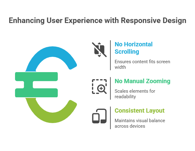
The primary purpose of responsive web design is to provide a seamless, consistent, and user-friendly experience. A truly responsive website ensures:
- No horizontal scrolling: Content automatically fits within the width of the screen, eliminating the need for awkward side-scrolling.
- No manual zooming: Text, images, and buttons are scaled appropriately so users don’t need to pinch or zoom in.
- Consistent layout: Regardless of device, the website maintains visual balance, usability, and readability.
These goals not only improve usability but also enhance trust and engagement, as visitors are more likely to stay on a site that feels intuitive and easy to navigate.
Core Techniques Behind Responsive Design
Modern web designers rely on a set of techniques and technologies to make responsiveness possible:
- Fluid Grids
Unlike fixed pixel-based layouts, fluid grids use proportional units (like percentages or viewport-based units). This allows elements such as columns, sections, and containers to resize naturally based on the screen size.
- Example: A column set to 50% width will always take up half of the screen—whether it’s viewed on a wide desktop or a compact phone.
- Flexible Images
Images in responsive design are not rigid. They are created to scale or crop proportionally without losing quality or distorting. Techniques such as using max-width: 100% in CSS or the HTML srcset attribute ensure that the right image is served for the right device.
- CSS Media Queries
Media queries are the backbone of responsiveness. They apply different CSS styles depending on characteristics like screen width, orientation (landscape/portrait), or resolution.
- Example: A three-column layout may display on desktops but automatically switch to a single-column layout on mobile screens for better readability.
Together, these three elements – fluid grids, flexible images, and media queries form the foundation of responsive web design.
SEO Advantages of Responsive Web Design
Responsive design is not just about looks; it’s also crucial for SEO performance. With Google’s mobile-first indexing, the search engine evaluates the mobile version of your site before ranking it. That means if your website isn’t mobile-friendly, it risks poor visibility in search results.
Other SEO benefits include:
- Improved site speed: Optimized responsive sites load faster across devices.
- Lower bounce rates: Visitors are less likely to abandon your site if it’s easy to navigate.
- Stronger rankings: Google rewards websites that provide a good mobile experience.
In short, responsive design improves both user experience and discoverability, making it a must-have for any serious web designer.
Why You Should Learn Responsive Design
Responsive design is no longer optional it is a fundamental skill for every modern web designer. Here’s why mastering it matters:
Mobile-First Audience
Over 60% of global internet traffic comes from mobile devices. Knowing how to design for mobile-first audiences makes you highly valuable in the job market.
Better SEO Rankings
Google favors mobile-friendly, responsive websites. Without them, your designs may struggle to rank well.
Enhanced User Experience
A responsive website ensures smooth navigation, readability, and interaction, directly impacting customer satisfaction and retention.
Cross-Device Compatibility
Responsive websites function flawlessly across all devices from desktops and laptops to smartphones, tablets, and even smart TVs. This versatility helps you deliver future-ready solutions.
How Elysium Academy Web Designing Course Builds Your Responsive Design Skills
At Elysium Academy web designing course, we understand that responsive design is a core industry requirement, not an add-on skill. That’s why our Web Designing Course is carefully structured to ensure students gain hands-on expertise in building responsive websites.
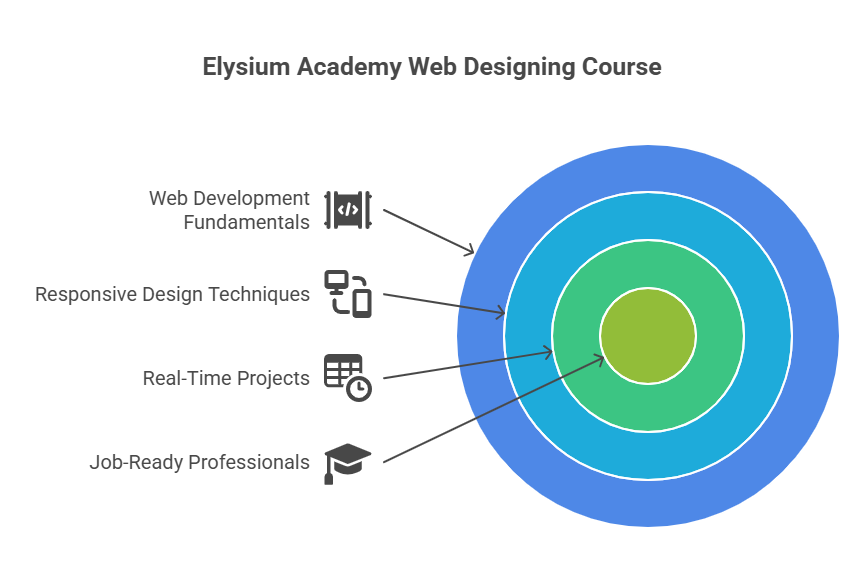
- Learn the fundamentals of HTML5, CSS3, and JavaScript.
- Master media queries and viewport settings for different screen sizes.
- Explore responsive grids and frameworks like Bootstrap.
- Work on real-time projects focused on mobile-first design.
- Understand the difference between adaptive vs. responsive design.
With this combination of theory and practice, students not only learn the principles but also apply them in live projects, making them job-ready professionals in web designing course and development.
Core Topics Covered in Responsive Design Module
The responsive design module in our Web Designing Course is designed to give students a deep, practical understanding of how websites adapt seamlessly across devices. Here’s a closer look at the essential topics covered:
1. Viewport Meta Tag
The viewport meta tag is a fundamental element in responsive web design. It instructs browsers on how to control a page’s dimensions and scaling on different devices. Students will learn how to configure the viewport for optimal layout, ensuring that content fits neatly on mobile screens without horizontal scrolling or awkward zooming. Mastering this tag is the first step in creating a mobile-friendly website that looks consistent across devices.
2. Flexible Grid Layouts
Fixed pixel layouts are no longer sufficient in a multi-device world. In this module, students explore flexible grid layouts, which use relative units such as percentages, vw (viewport width), and vh (viewport height). This allows website elements to resize proportionally, creating smooth layouts that adjust naturally to desktops, tablets, and smartphones. You’ll also learn about popular grid frameworks like Bootstrap, which simplify the creation of responsive, flexible layouts.
3. Media Queries
CSS media queries are a powerful tool that allows designers to apply different styles depending on device characteristics like screen width, height, orientation, or resolution. Through hands-on projects, students learn to define breakpoints, customize layouts for specific devices, and ensure that websites maintain usability and visual appeal across all screen sizes. Media queries are essential for creating truly adaptive and professional websites.
4. Responsive Images
Images play a critical role in website design, but they can also slow down performance if not handled correctly. In this module, students learn techniques to make images responsive, using HTML attributes like srcset and CSS properties such as background-size: cover. This web designing course ensures that images scale proportionally, maintain quality, and do not negatively impact page load times an important factor for both user experience and SEO.
5. Mobile-First Design Strategy
A mobile-first design strategy emphasizes designing for the smallest screens first and then progressively enhancing layouts for larger devices. This web designing course approach encourages simplicity, reduces content overload, and ensures the website works flawlessly on mobile devices, which make up the majority of internet traffic today. Students gain practical experience in building mobile-first interfaces, preparing them for real-world design scenarios where mobile usability is a top priority.
Real-World Project: Building a Fully Responsive Website
One of the highlights of the web designing course at Elysium Academy is the capstone project where learners are required to build a complete responsive website from scratch. This includes:
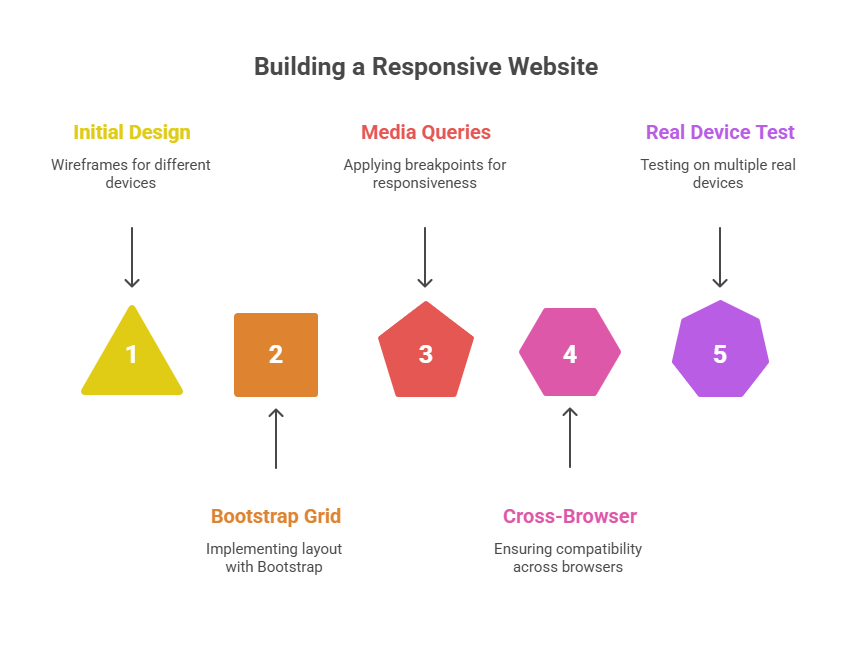
- Designing wireframes for mobile, tablet, and desktop
- Using Bootstrap grid system for layout
- Applying breakpoints using media queries
- Ensuring cross-browser compatibility
- Testing the design on multiple real devices
This hands-on experience ensures that you are not just learning, but applying responsive design principles in a real-world setting.
Course Highlights:
- Fundamentals of HTML5, CSS3, and JavaScript
- Media queries and viewport settings
- Responsive grids and frameworks like Bootstrap
- Real-time projects on mobile-first design
- Adaptive design vs. responsive design: key differences
With a blend of instructor-led sessions and self-paced projects, web designing course learners are encouraged to build full websites using responsive techniques. Each module is designed to take learners step-by-step from basics to professional standards.
Career Opportunities After Completing the Course
Responsive design is not just a technical skill – it’s a vital requirement for the modern digital world. With businesses increasingly prioritizing mobile-first and user-friendly websites, completing the Web Designing Course positions you for diverse and rewarding career opportunities across the tech industry.
Some of the most promising career paths include:
-
Front-End Developer – Build interactive, visually engaging websites by combining design principles with coding skills in HTML, CSS, JavaScript, and frameworks.
-
UI/UX Designer – Focus on creating intuitive and seamless user experiences while ensuring accessibility and design consistency across devices.
-
Web Designer – Conceptualize and design websites with responsive layouts, visual balance, and strong branding appeal.
-
Freelance Web Developer – Work independently, delivering responsive websites and design solutions for clients worldwide, offering flexibility and autonomy.
-
WordPress Developer – Specialize in building customized, responsive, and scalable websites using WordPress themes, plugins, and integrations.
Beyond these roles, your strong foundation in responsive design empowers you to explore entrepreneurial ventures such as starting your own design studio or digital agency. As businesses increasingly demand adaptable, cross-platform websites, the market for skilled professionals is expanding rapidly.
By mastering responsive design through this web designing course, you’re not only preparing for immediate job opportunities but also future-proofing your career in the ever-evolving web industry.
Tools and Technologies You’ll Master
To truly excel in responsive web design, you need more than just theoretical knowledge you need hands-on expertise with the tools and technologies that professionals use daily. In our Web Designing Course, you’ll gain confidence in:
- Adobe XD / Figma – Industry-leading platforms for wireframing, prototyping, and creating visually appealing user interfaces before moving into code.
- HTML5 & CSS3 – The building blocks of modern web pages, helping you structure content and style it with flexibility.
- JavaScript & jQuery – To add interactivity, animations, and dynamic content that adapts across devices.
- Bootstrap 5 – A powerful front-end framework that simplifies creating responsive layouts with ready-made components.
- Chrome DevTools – For testing, debugging, and fine-tuning responsive designs directly in the browser.
- Git & GitHub – Essential tools for version control, collaboration, and showcasing your projects to employers.
In addition, you’ll explore responsive testing tools that allow you to simulate various devices smartphones, tablets, desktops, and even smart TVs to ensure your websites look flawless everywhere.
Student Success Story: From Beginner to Pro
Meet Meenakshi, one of our inspiring alumni. When she first joined the Web Designing Course, she had no prior coding experience and felt intimidated by technical terms. Through our step-by-step curriculum, supportive mentorship, and hands-on projects, she quickly gained confidence.
Her final project was a mobile-first e-commerce website designed with responsive layouts and user-friendly navigation. Today, she is employed as a UI Designer at a digital agency in Chennai, where she manages responsive design for multiple clients across industries.
Stories like Meenakshi’s are common at Elysium Academy web designing course proof that with the right guidance, anyone can transition from beginner to professional in web designing course.
Advantages of Learning at Elysium Academy
At Elysium Academy, we don’t just teach theory. Our web designing course focus is on practical application, mentorship, and career growth. Here’s why students trust us for their web designing course journey:
- Industry-Recognized Certification – Strengthen your portfolio with credentials respected by top employers.
- Expert Mentorship – Learn directly from experienced designers and developers who know industry trends.
- Weekly Design Reviews – Get personalized feedback to refine your projects and improve faster.
- Career Support – Resume building, interview preparation, and placement assistance included.
- Lifetime Access – Continue revisiting course materials even after you graduate.
Whether you’re a student, working professional, or entrepreneur, our course helps you create responsive, user-friendly websites that meet modern business needs.
Common FAQs About Web Designing Course and Responsive Design
Q1: Do I need prior coding experience to join the Web Designing Course?
No. Our program is designed for beginners. We start with HTML and CSS basics before advancing to responsive techniques.
Q2: How long will it take to master responsive design?
Most students understand the fundamentals in 4–6 weeks. Full mastery comes from building multiple projects and consistent practice.
Q3: Will I receive a certificate after completing the course?
Yes. You’ll receive an Elysium Academy certification recognized by leading companies in India and abroad.
Q4: Are the classes online or offline?
We provide both online and classroom learning options, so you can choose what works best for you.
Q5: What is the average salary after completing this course?
Entry-level web designers with responsive design skills typically earn between ₹2.5 LPA to ₹5 LPA, with higher packages as you gain experience.
Q6: Is this course enough to become a full-stack developer?
This course builds a strong front-end foundation. To become a full-stack developer, you’ll need additional back-end training.
Q7: Will I get to build real websites in the course?
Absolutely! You’ll work on multiple hands-on projects, including a fully responsive website.
Start Your Journey with Elysium Academy
In today’s fast-paced digital era, having a website that adapts seamlessly to any device is no longer a luxury it’s a necessity. In web designing course Responsive design ensures that websites deliver an optimal user experience across desktops, tablets, and smartphones, making it one of the most in-demand skills for designers and developers. Whether you’re looking to establish yourself as a professional web designer, enhance your existing skills for career growth, or create a website for your own business, mastering responsive design is the key to standing out in this competitive industry.
At Elysium Academy web designing course, we go beyond traditional teaching by combining theoretical knowledge with hands-on practice. Our responsive web designing course training program is structured to help you understand the core principles of flexible layouts, media queries, fluid grids, and modern frameworks. Along with real-time projects, you’ll gain the practical exposure needed to build websites that not only look stunning but also perform effectively across all platforms. With the support of experienced mentors and industry experts, you’ll be equipped to solve real-world design challenges with confidence.
Your journey toward becoming a responsive design expert begins here. By enrolling at Elysium Academy web designing course, you’re not just learning a skill you’re preparing for a future full of opportunities in web designing course, digital marketing, and online business. Take the first step today and invest in your growth. With the right guidance, tools, and dedication, you’ll transform your creative vision into impactful designs that make a difference in the digital world.